The Why
Several years back I was bitten by the stock trading bug. 99.9% of the time I just invest various index funds. I do however maintain a Robinhood account to play around with trying to pick individual stock winners. The three main reasons I chose Robinhood are
- Fractional Shares
- Free Trades
- FREE STOCK
Who doesn't like free?
In order to try to pick winners, you have to do some sort of technical analysis. According to Investopedia "Technical analysis is a trading discipline employed to evaluate investments and identify trading opportunities by analyzing statistical trends gathered from trading activity, such as price movement and volume".
Technical analysis can be comprised of many different evaluation techniques. In this article, I will show you how to quickly build a simple technical analysis of an individual stock. I make no claims as to the accuracy or efficacy of this analysis and it is just placed here as yet another experiment of how easy it is to get data from the internet. Please see the disclaimer link at the top of maketimelabs.com before proceeding.
The How
For this analysis we will be using pandas, plotly, and pandas-datareader.
First, we will use pandas data reader to pull our stock data from Yahoo Finance
import pandas as pd
import pandas_datareader as pdr
import datetime
import plotly.graph_objects as go

start = datetime.datetime(2019,1,1)
end = datetime.date.today()

stock = "PRPL"

df = pdr.DataReader(stock, "yahoo", start, end).reset_index()

df.head()
| Date | High | Low | Open | Close | Volume | Adj Close | |
|---|---|---|---|---|---|---|---|
| 0 | 2019-01-02 | 5.949 | 5.58 | 5.868 | 5.79 | 6600 | 5.79 |
| 1 | 2019-01-03 | 5.790 | 5.50 | 5.520 | 5.50 | 10800 | 5.50 |
| 2 | 2019-01-04 | 5.500 | 5.02 | 5.500 | 5.20 | 15700 | 5.20 |
| 3 | 2019-01-07 | 5.270 | 5.01 | 5.010 | 5.27 | 1500 | 5.27 |
| 4 | 2019-01-08 | 5.170 | 4.98 | 5.160 | 4.99 | 6300 | 4.99 |
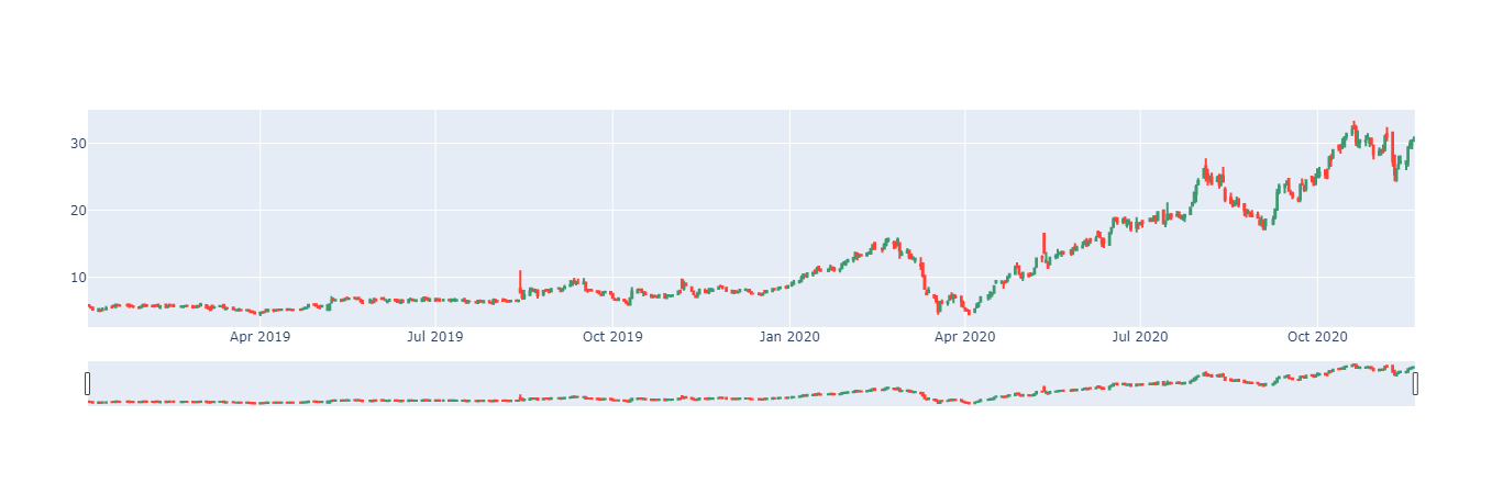
Next, we can create a candlestick chart for our chosen stock.
You can see that the candlestick object accepts values for ticker open, close, high and low. We also need to stipulate the x-axis which for our candlestick plot will be Date.
candlestick = go.Figure(
    data=[
        go.Candlestick(
            name=stock,
            x=df['Date'],
            open=df['Open'],
            high=df['High'],
            low=df['Low'],
            close=df['Close']
        )
    ]
)

candlestick.show()
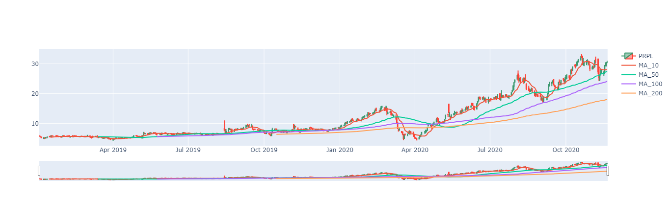
Next, let's add some simple moving averages. According to investopedia.com, "A simple moving average (SMA) calculates the average of a selected range of prices, usually closing prices, by the number of periods in that range". Basically and SMA takes a window of our data and gives us an average value of that window.
In pandas getting an SMA column is quite easy. For example, if we wanted a 10 day SMA, we would just create a new column and fill it was the rolling average values for the adjusted close.
df['MA10'] = df["Adj Close"].rolling(10).mean()
df['MA10'].tail()
473    27.967
474    28.006
475    28.117
476    28.057
477    28.012
Name: MA10, dtype: float64
Commonly technical analysts use multiple SMA's with varying windows. For this analysis, I intend to display 10, 50, 100, and 200 day SMA's. I could write an individual line for each of these new columns but hey, I am using python for a reason. First I create a list of the SMA's I wish to create then loop through that list creating a column for each list entry.
sma_s=[10,50,100,200]
for sma in sma_s:
    df[f'MA{sma}'] = df["Adj Close"].rolling(sma).mean()
df.iloc[:,6:].tail()
| Date | Adj Close | MA10 | MA50 | MA100 | MA200 | |
|---|---|---|---|---|---|---|
| 473 | 2020-11-16 | 27.290001 | 27.967 | 26.8363 | 23.65675 | 17.768375 |
| 474 | 2020-11-17 | 29.350000 | 28.006 | 27.0513 | 23.77775 | 17.846825 |
| 475 | 2020-11-18 | 29.860001 | 28.117 | 27.2457 | 23.89505 | 17.929525 |
| 476 | 2020-11-19 | 30.400000 | 28.057 | 27.4018 | 24.01905 | 18.014825 |
| 477 | 2020-11-20 | 30.590000 | 28.012 | 27.5422 | 24.14365 | 18.101575 |
Now that we have our desired SMA's, let's add them to our candlestick chart. Again using a for loop.
for sma in sma_s:
    candlestick.add_trace(
        go.Scatter(name=f'MA_{sma}', x=df['Date'], y=df[f'MA{sma}']),
    )
candlestick.show()
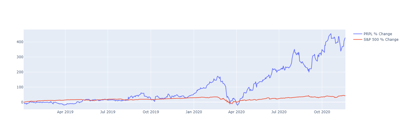
Next, let's add a comparison to the S&P 500. To normalize the data for easy comparison, we can use % returns over time of both the S&P 500 and our chosen stock.
We need to calculate our percent change from day to day
df['% change'] = df['Adj Close'].pct_change(1)
Next we will calculate the cumulative returns
df['% returns'] = (df['% change'] + 1).cumprod() - 1
Finally we will multiply the percent by 100 just for visual clarity
df['% returns'] = df['% returns'] * 100

df.tail()
| Date | MA10 | MA50 | MA100 | MA200 | % change | % returns | |
|---|---|---|---|---|---|---|---|
| 473 | 2020-11-16 | 27.967 | 26.8363 | 23.65675 | 17.768375 | 0.004786 | 371.329898 |
| 474 | 2020-11-17 | 28.006 | 27.0513 | 23.77775 | 17.846825 | 0.075486 | 406.908473 |
| 475 | 2020-11-18 | 28.117 | 27.2457 | 23.89505 | 17.929525 | 0.017376 | 415.716767 |
| 476 | 2020-11-19 | 28.057 | 27.4018 | 24.01905 | 18.014825 | 0.018084 | 425.043175 |
| 477 | 2020-11-20 | 28.012 | 27.5422 | 24.14365 | 18.101575 | 0.006250 | 428.324704 |
In comparison to our new % returns column we also need to get the % returns of the S&P 500. We can again use yahoo finance. On to look up the S&P 500 index using yahoo finance we can use the ticker symbol ^GSPC. Like our previous ticker symbol, we will also need to calculate the % change and the % returns
SP500 = pdr.DataReader('^GSPC', "yahoo", start, end).reset_index()
SP500['% change'] = SP500['Adj Close'].pct_change(1)
SP500['% returns'] = (SP500['% change'] + 1).cumprod() - 1
SP500['% returns'] = SP500['% returns'] * 100

SP500.tail()
| Date | High | Low | Open | Close | Volume | Adj Close | % change | % returns | |
|---|---|---|---|---|---|---|---|---|---|
| 473 | 2020-11-16 | 3628.510010 | 3600.159912 | 3600.159912 | 3626.909912 | 5281980000 | 3626.909912 | 0.011648 | 44.496674 |
| 474 | 2020-11-17 | 3623.110107 | 3588.679932 | 3610.310059 | 3609.530029 | 4799570000 | 3609.530029 | -0.004792 | 43.804257 |
| 475 | 2020-11-18 | 3619.090088 | 3567.330078 | 3612.090088 | 3567.790039 | 5274450000 | 3567.790039 | -0.011564 | 42.141329 |
| 476 | 2020-11-19 | 3585.219971 | 3543.840088 | 3559.409912 | 3581.870117 | 4347200000 | 3581.870117 | 0.003946 | 42.702281 |
| 477 | 2020-11-20 | 3581.229980 | 3556.850098 | 3579.310059 | 3557.540039 | 4218970000 | 3557.540039 | -0.006793 | 41.732967 |
Now let's plot our returns
returns = go.Figure()

returns.add_trace(
    go.Scatter(name=f'{stock} % Change', x=df["Date"], y=df['% returns'])
)

returns.add_trace(
    go.Scatter(name='S&P 500 % Change', x=SP500["Date"], y=SP500['% returns'])
)

returns.show()
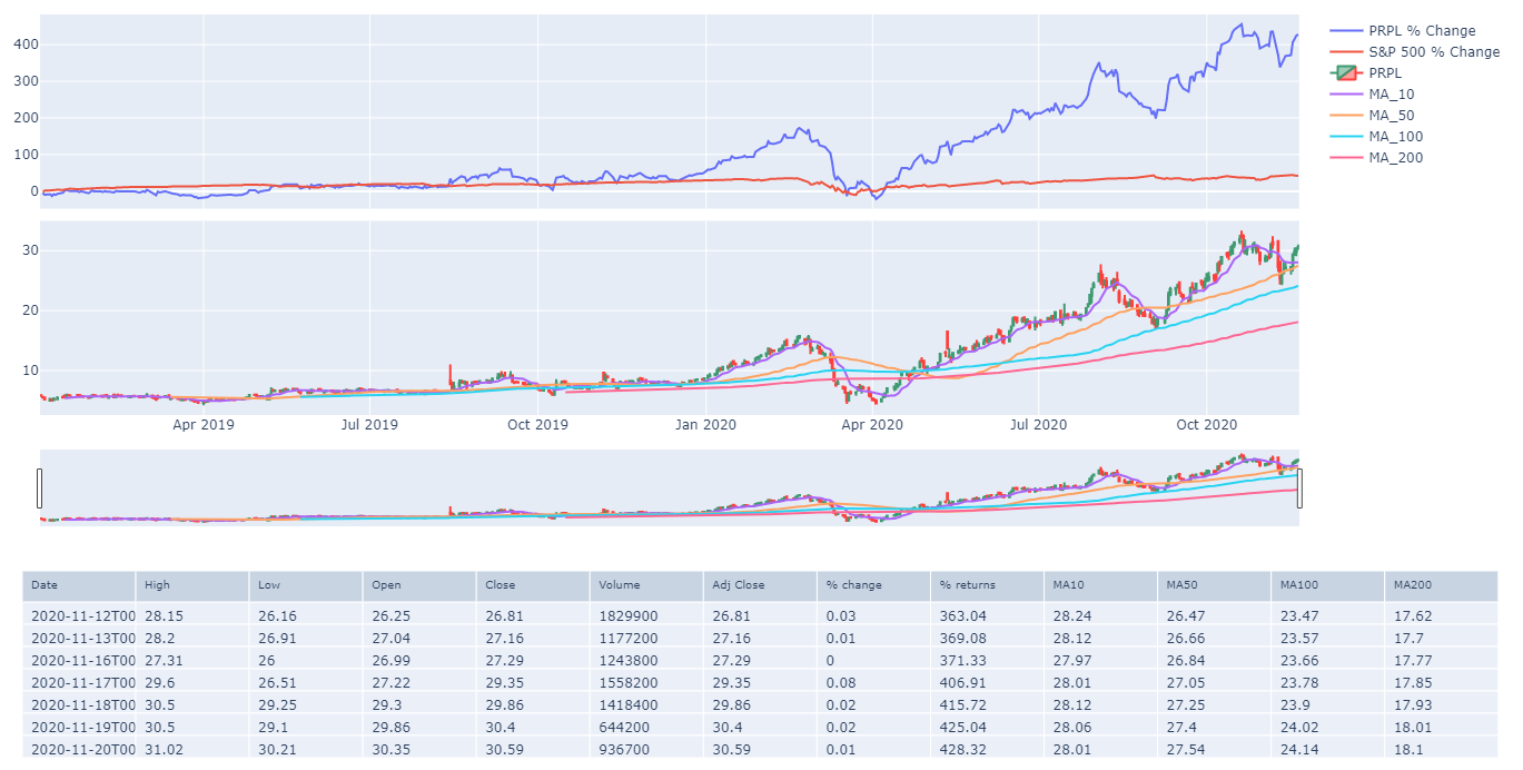
We now have quite a bit of information to perform our technical analysis, but what if we want our candlestick range slider to also filter our returns chart. For that, we need to revise some of our code.
First, we are going to create an entirely new figure, but this time we are going to stipulate 2 rows of graph objects
from plotly.subplots import make_subplots
fig = make_subplots(
    rows=2, cols=1,
    shared_xaxes=True,
    vertical_spacing=0.03,
    specs=[
        [{"type": "xy"}],
        [{"type": "xy"}],
    ]
)
Now that we have our new figure object, we are going to add our returns chart to the first row then we will add our candlestick to our second row
fig.add_trace(
    go.Scatter(name=f'{stock} % Change', x=df["Date"], y=df['% returns']),
    row=1, col=1,
)
fig.add_trace(
    go.Scatter(name='S&P 500 % Change', x=SP500["Date"], y=SP500['% returns']),
    row=1, col=1,
)

fig.add_trace(
    go.Candlestick(
        name=stock,
        x=df['Date'],
        open=df['Open'],
        high=df['High'],
        low=df['Low'],
        close=df['Close']
    ),
    row=2, col=1,
)

for sma in sma_s:
    fig.add_trace(
        go.Scatter(name=f'MA_{sma}', x=df['Date'], y=df[f'MA{sma}']),
        row=2, col=1,
    )

fig.update_layout(margin=dict(l=20, r=20, t=20, b=20), height=500)
The last thing I would like to add to our technical analysis for the time being is our data table however I would like the data table to match my returns and candlestick plots. I can do this by again using plotly
tbl = go.Figure(
    data=[
        (
            go.Table(
                header=dict(
                    values=list(df.columns),
                    font=dict(size=10),
                    align="left"
                ),
                cells=dict(
                    values=[df.tail(7).round(2)[c].tolist() for c in df.columns],
                    align = "left")
            )
        )
    ]
)
tbl.update_layout(margin=dict(l=20, r=20, t=20, b=20))

fig.show()
tbl.show()
Tying it all together
You could very easily change the ticker symbol and the date range to get a simplistic technical analysis of any stock you wanted. In a future article, I will show how to include technical indicators in this type of analysis.
import pandas as pd
import pandas_datareader as pdr
import datetime
import plotly.graph_objects as go
from plotly.subplots import make_subplots

start = datetime.datetime(2019,1,1)
end = datetime.date.today()

stock = "PRPL"
sma_s=[10,50,100,200]
Margin=dict(l=20, r=20, t=20, b=20)

df = pdr.DataReader(stock, "yahoo", start, end).reset_index()
df['% change'] = df['Adj Close'].pct_change(1)
df['% returns'] = (df['% change'] + 1).cumprod() - 1
df['% returns'] = df['% returns'] * 100

for sma in sma_s:
    df[f'MA{sma}'] = df["Adj Close"].rolling(sma).mean()

SP500 = pdr.DataReader('^GSPC', "yahoo", start, end).reset_index()
SP500['% change'] = SP500['Adj Close'].pct_change(1)
SP500['% returns'] = (SP500['% change'] + 1).cumprod() - 1
SP500['% returns'] = SP500['% returns'] * 100

fig = make_subplots(
    rows=2, cols=1,
    shared_xaxes=True,
    vertical_spacing=0.03,
    specs=[
        [{"type": "xy"}],
        [{"type": "xy"}],
    ]
)

fig.add_trace(
    go.Scatter(name=f'{stock} % Change', x=df["Date"], y=df['% returns']),
    row=1, col=1,
)
fig.add_trace(
    go.Scatter(name='S&P 500 % Change', x=SP500["Date"], y=SP500['% returns']),
    row=1, col=1,
)

fig.add_trace(
    go.Candlestick(
        name=stock,
        x=df['Date'],
        open=df['Open'],
        high=df['High'],
        low=df['Low'],
        close=df['Close']
    ),
    row=2, col=1,
)

for sma in sma_s:
    fig.add_trace(
        go.Scatter(name=f'MA_{sma}', x=df['Date'], y=df[f'MA{sma}']),
        row=2, col=1,
    )

tbl = go.Figure(
    data=[
        (
            go.Table(
                header=dict(
                    values=list(df.columns),
                    font=dict(size=10),
                    align="left"
                ),
                cells=dict(
                    values=[df.tail(7).round(2)[c].tolist() for c in df.columns],
                    align = "left")
            )
        )
    ]
)

fig.update_layout(margin=Margin, height=500)
fig.show()
tbl.update_layout(margin=Margin)
tbl.show()
Click the binder link below for an interactive version of this article
![]()